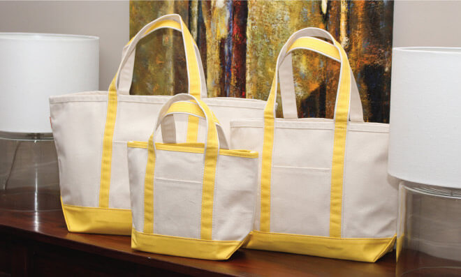
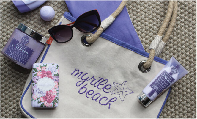
We are so excited to announce the launch of our new website! Over the past year our customers have been kind enough to submit their feedback, letting us know what worked, what didn’t, and what ideas they had for changes. We listened carefully to that feedback and used it as a guide for the redesign of our site. Here are five major changes we’ve made because of customers like you.New Photos
This was a big response we got from customers - the need for fresh, new and more representational photos of our products. After a long search we found a great photographer here in the Atlanta-area who happily took on the process of shooting our entire catalog of products. As you browse through that catalog here online, you will notice a few things with the images: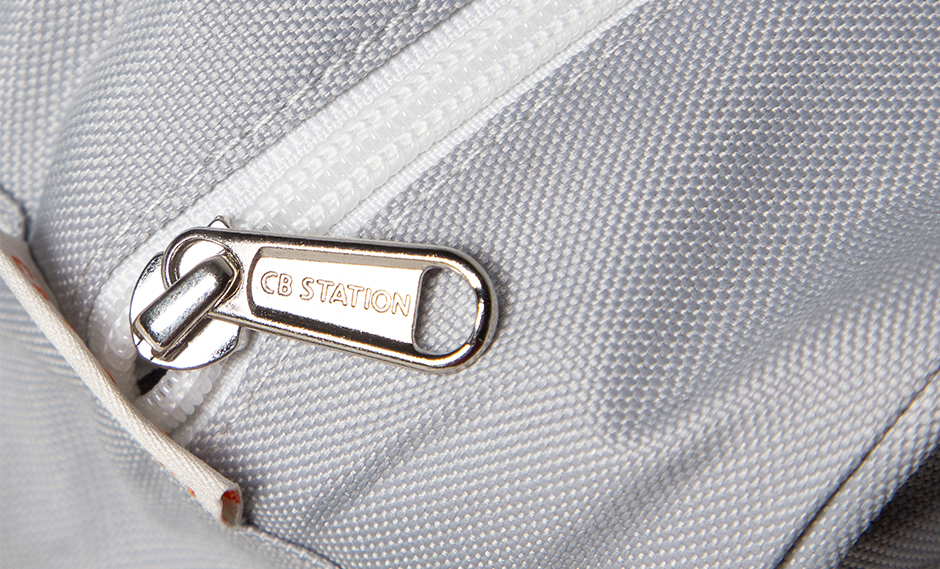
- Lighting - The photos look a little brighter and more readily show off colors, textures, and allow for finer details to be seen. This is to help showcase the high quality of materials we use in our products.
- Models - We’ve replaced photos of our products on a mannequin with photos of our products on real people as they would naturally carry or hold each product. Not only does this allow customers to judge the size or scale of whatever product they’re looking at, these photos offer our customers high-quality commercial images that are more usable for their product marketing needs.
Website Design & Navigation
This was another big response we got - the need for a fresher design that improved navigation. With that in mind, we came up with a design that is cleaner with more white space, making products more visible and descriptions more readable. Additionally, the navigation requires less clicking, ensuring you can get to the product you’re looking for in the fastest amount of time.Personalization
We’ve taken our most popular feature, our personalization tool, and made it a whole lot easier to find and to work with. Options are clearly laid out, and color swatches are as close to in-person colors as we can possibly get. With a few short clicks, you can immediately see how a monogram or embroidered image will look on the product you are ordering.One-Page Checkout
Checkout has been slimmed down and made much, much more simple to go through. Rather than take you through multiple steps across multiple pages, we have brought all the steps to one page. It’s easy to read, cleanly laid out, and a snap to walk through. In no time at all you can go from a full cart to a completed order.Product Tags
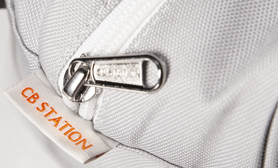
This change is a bit different from the others, which really focus on the online experience for customers like you. This change is physical. We’ve heard you mention that our signature orange tag often takes away from the personalization that customers request on their products, rather than blending in enough to allow those customizations to really stand out. To address this issue, we are taking the orange tag and changing it to an off-white-ish color that blends in better with the product itself. This change will take a little bit longer to complete, but as we start to cycle out of old stock and reorder new, you will see the new tag more and more frequently. With these changes rolling out, we invite you to drop by our home page and take a look around. Check out the site, the products, and let us know what you think!Here at CB station, we strive to create timeless designs that are stylish and functional for the personalized gift industry. We also aim to create good in all of our actions. Because we care about the environment and the people behind the products, we do everything in our power to ensure that each product doesn’t just benefit the end-user, but every person along the way, from the field to your store. Thank you for shopping at CB Station!
New Photos
This was a big response we got from customers - the need for fresh, new and more representational photos of our products. After a long search we found a great photographer here in the Atlanta-area who happily took on the process of shooting our entire catalog of products. As you browse through that catalog here online, you will notice a few things with the images:
- Lighting - The photos look a little brighter and more readily show off colors, textures, and allow for finer details to be seen. This is to help showcase the high quality of materials we use in our products.
- Models - We’ve replaced photos of our products on a mannequin with photos of our products on real people as they would naturally carry or hold each product. Not only does this allow customers to judge the size or scale of whatever product they’re looking at, these photos offer our customers high-quality commercial images that are more usable for their product marketing needs.
